This is lesson 5 of the Mini Web App course, which walks you through the creation of a simple web application, covering HTML and CSS, PHP, Bootstrap, Local Storage, and more.
In the previous lessons, we’ve been focused mainly on the functionality of our New Year’s Resolution list. Now it’s time to take a step back and focusing on how the implementation of its design can have a profound impact on its overall usability.
Part 1: Responsive Web design and mobile optimization with HTML5, CSS3, and Bootstrap
With it now being possible to access the Web on a multitude of different devices of all shapes and sizes, it has become more important than ever to make sure that the presentation of web pages is optimized based on the device they’re being viewed on.
Prevalence of mobile access
More than ever before, people are accessing content on mobile devices. As of 2013, there were over 1.2 billion people accessing the Web from their mobile devices, with mobile traffic accounting for 15% of all Internet traffic. That number is expected to continue to rise, with mobile traffic expected to surpass desktop traffic in the not-so-distant future.
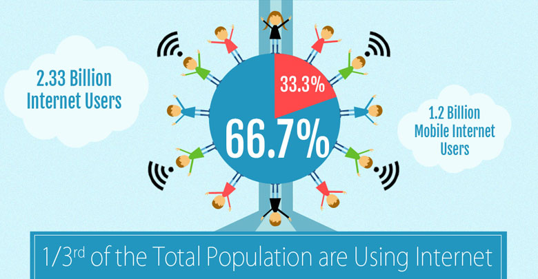 From Dekh’s “The Mobile Web” infographic
And you may very well be adding to those statistics, yourself. Because when it comes down to it, frequently it’s just easier to access content via a mobile device, because it’s (almost always) on your person. You’re most likely visiting this page because you received an email about it (and if that’s not the case, be sure to sign up). And now that your email is almost always with you (if you have a smartphone), you’re much more likely to access links like these via your phone. Obviously, web development needs to adapt with widespread changes like these.
Adaptation via “mobile first” design
It used to be that, when designing a website, you first began with the desktop design and considered designs for other devices second. But with the rapid increase of mobile Web access, many people are now following the philosophy known as “mobile first” design. As you may now have guessed, mobile first design approaches the problem from the other direction: designing with mobile devices in mind, first, ensuring those designs scale up for larger displays, second. These days, you lose a lot by not having a site that’s mobile-friendly. Think about it: if someone’s on their phone and visits a site that’s not mobile-optimized, what’s the chance they’ll leave and revisit it later on a desktop? Slim to none, in most cases.
Additionally, how well your site functions across multiple devices can have profound effects on how people view your business. In a recent collection of stats making a case for smarter site design, HubSpot encountered many such findings, including the following:
“48% of users say that if they arrive on a business site that isn’t working well on mobile, they take it as an indication of the business simply not caring.”
With so many visitors accessing sites via mobile devices and such important usability (and financial) implications, it’s no wonder that mobile first design is getting so much attention as of late. It’s nearly a requirement to design with mobile users in mind, otherwise you’d be cutting off so much of your potential audience.
So, how do we go about doing that?
What about creating apps?
First, creating an native app is much easier said than done. App design and development have significant differences to their Web counterparts. This leaves you with essentially two choices: 1) take a bunch of time to properly learn app development; or 2) pay a significant amount of money to have someone else build you an app.
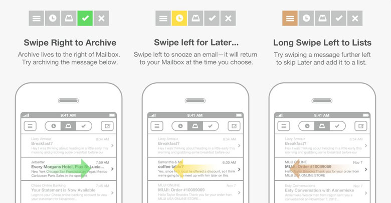
Granted, sometimes it’s definitely the right choice to go about building an app. Don’t get me wrong. When you aim is to provide a completely new experience, or one that takes advantage of, say, all of the features inherent to the iPhone, it makes sense. Take the Mailbox app for iPhone as an example; it requires various swipe gestures to activate much of its core functionality, something that’s impossible on desktop computers.
But in the majority of cases, especially when your primary goal is simply to ensure people on all devices can access your content, it’s just not worth the time and/or money to build an app. Luckily for us, implementing mobile-optimized designs is easier than ever.
Using responsive Web design to create mobile-friendly sites
Responsive Web design: a term you may have heard thrown around and may even be familiar with. Responsive Web design is the design approach which aims to provide an optimal viewing experience across a wide range of devices.
That means, if you’re viewing a site that’s followed proper responsive Web design principles, it will be visually optimized whether you’re viewing it on a desktop, tablet, smartphone, or device of any size, for that matter.
In fact, this very site is responsive. If you’re on a desktop, go ahead and test it out by altering the size of your browser window, and notice how the appearance chances accordingly. If you’re on a mobile device, well then, you’re welcome! Without a responsive design, reading this page may be quite a struggle.
And the best thing about responsive Web design? You get to use the same Web design and development skills you already have.
Now, as you’ll see shortly, there are even frameworks that take care of most of the heavy lifting for you, make it extremely easy to implement a responsive, mobile-optimized design.
A quick example
Let’s take a look at a brief example to see just how easy implementing a responsive design can be. Here’s an example of some HTML and CSS code that would render a two column layout:
<style>
  .column {
    float: left;
    width: 50%
  }
</style>

<div class="column">
  Left column
</div>
<div class="column">
  Right column
</div>
But what if we wanted to view the above example on a mobile device?
Viewing the content as-is, arranged in two columns, doesn’t make much sense on a device that small. So how can we address that?
Simple: when we detect that the user is viewing the page on a mobile device (e.g. one that’s 480 pixels, or fewer, wide), we’ll show the columns stacked on top of one another as opposed to side-by-side:
<style>
  .column {
    float: left;
    width: 50%
  }

@media (max-width: 480px) {
  .column {
    float: none;
    width: 100%
  }
}
</style>

<div class="column">
  Left column
</div>
<div class="column">
  Right column
</div>
You’ll notice the added @media declaration. That tells the browser “If the user’s device is <= 480 pixels wide, apply these CSS rules.” So when someone on a phone, for example, is viewing the site, it will now automatically make those column elements full-width, providing a much better viewing experience.
And you can define as many @media blocks as you would like, targeting any number of different device sizes. It’s really that easy! By using your existing HTML and CSS skills and learning a few new CSS tricks, you can create an effective responsive design.
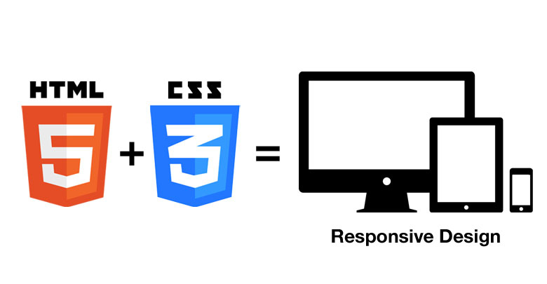
HTML5 and CSS3 make it all possible
Just like any other programming language, HTML and CSS also have “versions”. They both follow standards, and these are the latest revisions of each of the languages’ respective standards.
If you’ve heard nightmares about Internet Explorer (IE) or other older browsers, it’s because they don’t support the newest standards, which means they don’t correctly understand the language in its most up-to-date form. It’d be like if you took two years of Spanish in middle school 10 years ago and then went to Spain tomorrow and tried to seamlessly integrate, speaking fluently. It wouldn’t work out too well.
It’s up to the browser to be able to interpret your HTML and CSS code properly. And luckily, nearly all modern-day browsers support HTML5 and CSS3, which are what make it possible for us to implement a responsive Web design so easily. CSS3 allows for all kinds of display alterations that used to require custom JavaScript or that used to be essentially impossible. Things such as rounded corners, dropdown shadows, and the like — that are now commonplace — used to require fancy JavaScript calculations.
You know how you create a container with rounded corners, today? Using the following CSS rule:
  .rounded {
    border-radius: 5px;
  }
That’s it. Oh how I wish it were that simple when I first started. But I digress.
And maybe even more importantly, CSS3 allows us to define rules that target specific device sizes, as we saw previously. Read that again. It’s the essence of responsive Web design.
If you’re able to change styles based on the size of the user’s device, you’ve just unlocked the potential to customize the entire display based on the type of device the viewer is using. Using only HTML and CSS.
No app required. No fancy new languages. No tons of extra money or time. Just your current skills and a little bit of extra work. And remember before when I mentioned that frameworks exist that make this even easier…?
Introducing the Bootstrap framework

Bootstrap is the most popular of framework for responsive Web design currently in existence.
I mentioned before that this site is responsive; well, it’s also powered by Bootstrap. I swear by Bootstrap for almost any project I tackle these days that requires a responsive Web design. It provides multiple benefits: CSS classes for simple, elegant styling of common page elements; an easy grid system for responsive Web design implementations; and JavaScript for common user interface components.
For many projects, you’ll still need some amount of customization, but Bootstrap provides you with a great starting point and can save you a boatload of time in the long run.
The contents of Bootstrap
And what’s required to get access to all of Bootstrap’s great functionality? Not much: a CSS class containing all of its predefined classes and responsive-related definitions; a few font files used to create icons (see why icon fonts are awesome); and an optional JavaScript file containing code for all of the aforementioned components.
That’s it: 4 files.
Basics of the Bootstrap grid system
Bootstrap uses a grid system in order to define layouts. The grid system is based on 12 columns and various device sizes:
| Extra small devices Phones (<768px) | Small devices Tablets (≥768px) | Medium devices Desktops (≥992px) | Large devices Desktops (≥1200px) | |
|---|---|---|---|---|
| Container width | None (auto) | 750px | 970px | 1170px |
| Class prefix | .col-xs- |
.col-sm- |
.col-md- |
.col-lg- |
As you can see, its focused on four main device sizes: phones, tablets, and two sizes of desktops. The grid system also relies on a universal .container element; you’ll also notice that each device size has a corresponding predefined width for its .container element. Let’s take a look at how we can use Bootstrap to implement our previous two-column layout:
<div class="container">
  <div class="row">
    <div class="col-sm-6">
      Left column
    </div>
    <div class="col-sm-6">
      Right column
    </div>
  </div>
</div>
There are few things to note in the example above.
First of all, there’s no CSS required! Bootstrap’s predefined classes take care of the responsive aspects — the width of the .container and columns — for us, automatically.
Second, you’ll notice the use of col-sm-, which means our layout will be applied on all devices ≥ 768 pixels wide, as shown in the table above. And third, our columns will be half width, as designated by the -6. (Remember that Bootstrap’s grid is based on a total of 12 columns, so something 6 columns wide would be half-width.)
Targeting multiple device sizes in the same layout
Bootstrap makes it easy to target multiple device sizes in all of your layouts. So say we wanted to adapt our previous example so that on tablets, our columns are full-width, but on desktops, they’re still half-width.
We could accomplish that using the following:
<div class="container">
  <div class="row">
    <div class="col-sm-12 col-md-6">
      Left column
    </div>
    <div class="col-sm-12 col-md-6">
      Right column
    </div>
  </div>
</div>
That tells our display “If viewing on a tablet (or higher), make the columns half-width (or 6 columns wide), but if on a phone, make them full-width (or 12 columns wide).” This gives you the potential to implement all kinds of interesting design layouts, as you may be able to imagine.
Toggling elements based on device size
Bootstrap also makes it very easy to toggle the display of specific elements on various device sizes using responsive utility classes:
| Extra small devices Phones (<768px) | Small devices Tablets (≥768px) | Medium devices Desktops (≥992px) | Large devices Desktops (≥1200px) | |
|---|---|---|---|---|
.visible-xs |
Visible | Hidden | Hidden | Hidden |
.visible-sm |
Hidden | Visible | Hidden | Hidden |
.visible-md |
Hidden | Hidden | Visible | Hidden |
.visible-lg |
Hidden | Hidden | Hidden | Visible |
.hidden-xs |
Hidden | Visible | Visible | Visible |
.hidden-sm |
Visible | Hidden | Visible | Visible |
.hidden-md |
Visible | Visible | Hidden | Visible |
.hidden-lg |
Visible | Visible | Visible | Hidden |
So, for example, say you had a large image that looks great when your site is being viewed on larger devices but it appeared out of place when viewed on a phone. You could hide it when the page is viewed on a phone simply by adding the .hidden-xs class:
<h1>My page</h1>
<img class="large-image <strong>hidden-xs</strong>">
The image would then be visible when viewing the site on a desktop or tablet and hidden when viewing it on a phone. No other code required.
Mobile first design in Bootstrap
As of the latest version, version 3, Bootstrap is based on the concept of mobile first design, as we spoke about earlier.
While the .container element allows you to contain elements to a certain width, the rest of Bootstrap’s layout system is percentage-based. That keeps mobile device support at the forefront, by ensuring that the smallest devices are always supported.
You’ll also notice that, by default, all columns, when viewed on phones, are shown at full-width, which is almost always the optimal design choice. So the main takeaway is that Bootstrap now supports mobile devices by default, out of the box.
Using Bootstrap to style common elements
Bootstrap also provides a lot of simple, but elegant, out-of-the-box styling classes for common elements, such as forms, buttons, and tables.
In fact, those nice-looking tables from Bootstrap’s documentation above are styled using built-in Bootstrap styles. Simply by taking a typical HTML table and adding a few classes to it — table table-bordered table-striped — the table is given a nice, consistent layout, cells with borders (courtesy of table-bordered), and alternating highlighted rows (thanks to table-striped):
<table class="table table-bordered table-striped">
  <thead>
    <tr>
      <th>Header 1</th>
      <th>Header 2</th>
      <th>Header 3</th>
    </tr>
  </thead>
  <tbody>
    <tr>
      <td>A cell</td>
      <td>A cell</td>
      <td>A cell</td>
    </tr>
    <tr>
      <td>A cell</td>
      <td>A cell</td>
      <td>A cell</td>
    </tr>
  </tbody>
</table>
which would produce the following:
| Header 1 | Header 2 | Header 3 |
|---|---|---|
| A cell | A cell | A cell |
| A cell | A cell | A cell |
Bootstrap provides similar CSS settings for plenty of HTML elements to, again, make your life easier.
Using Bootstrap for common UI components
Bootstrap also contains a JavaScript library that allows you to easily create common components such as modals, accordions, and tabs. And best of all, nearly all of them can be created/activated without any JavaScript. For example, you can create a tab navigation without any JavaScript by simply using data-toggle="tab" and href attribute values that correspond to the tabs’ matching panes, like so:
<!-- Nav tabs -->
<ul class="nav nav-tabs">
  <li class="active"><a href="#panel_1" data-toggle="tab">Tab 1</a></li>
  <li><a href="#panel_2" data-toggle="tab">Tab 2</a></li>
  <li><a href="#panel_3" data-toggle="tab">Tab 3</a></li>
</ul>

<!-- Tab panes -->
<div class="tab-content">
  <div class="tab-pane active" id="panel_1">Fingerstache sustainable PBR&B dreamcatcher chambray squid leggings cardigan pug.</div>
  <div class="tab-pane" id="panel_2">Gluten-free whatever drinking vinegar Helvetica sriracha.</div>
  <div class="tab-pane" id="panel_3">Pitchfork whatever Vice occupy scenester.</div>
</div>
which would produce the following:
And that’s just the tip of the iceberg. There are many other JavaScript components that Bootstrap makes it trivial to implement. Needless to say, Bootstrap is very powerful. Let’s take a look at how we can put it to work for us.
Part 2: Utilizing Bootstrap to make our New Year’s Resolution list responsive
Note: Since we’ll be working with responsive design and optimizing the display of our page at multiple sizes, this week’s exercise will be best performed on a desktop (as opposed to from your smartphone); by working on a desktop, you’ll have the ability to resize your browser window and see the changes at each display size take effect.
While we’ll still be working with our New Year’s Resolution list we’ve been creating throughout the Mini Web App, in this week’s exercise, we won’t be adding any new functionality.
Today, we’ll be optimizing its display, making it look nice and function well on devices of all sizes. With that in mind, we’ll only be focused on making changes to our HTML and CSS code. Again, the existing JavaScript code will be included, but it’s not shown, as you won’t be required to make any changes to it.
You’ll notice that I removed our current CSS styling and slightly changed the HTML of our existing list and “add resolution” form, as we’ll be adapting our display to take advantage of the nice built-in styling offered by Bootstrap.
Additionally, I took the liberty of re-implementing resolution descriptions and of implementing “completed” checkboxes to the list items (one of the additional tasks in Part 3 of Lesson 2 — great job if you already tackled it, as well!), which we’ll be using towards the end of the exercise.
And finally, you’ll see a new set of buttons below the Webpage Preview display that allow you to toggle between desktop, tablet, and mobile device display sizes, allowing you to verify that your changes work properly across all devices.
Resources
As always, below is a list of all of the resources you may need to complete each step:
- Step 1
- Step 2
- Step 3
- Step 4
- Step 5
Step 1: Add a menu and put our content in a container
We only want our menu to contain two things: 1) the name of our "app," "New Year of Coding Resolution List"; and 2) a menu item/button, "Add Resolution". As you’ll see shortly, the button will be used to toggle our new, adapted "add resolution" item form.
Luckily for us, Bootstrap makes this very easy. At the top of the HTML editor, add a Bootstrap navbar with the CSS classes
navbar navbar-static-top navbar-inverse that contains our app’s name, or brand (hint), and a single "Add Resolution" menu item, as discussed.Make sure to include the
navbar-toggle element, which is used when displaying the button that toggles the collapsed menu on mobile displays. Additionally, make sure that you set an id value for your navbar-collapse element and a corresponding value for the navbar-toggle element's data-target.And notice how, when you toggle the display between the different device sizes, Bootstrap automatically handles altering the menu for you!
Finally, go ahead and wrap our page's core content in a
container element.
<nav class="navbar navbar-static-top navbar-inverse" role="navigation">
  <div class="container">
    <!-- Brand, toggle, menu item elements go here -->
  </div>
</nav>
container is necessary for establishing the proper width of the menu, based on the device size.
<div class="navbar-header">
  <button type="button" class="navbar-toggle" data-toggle="collapse" data-target="#main_menu">
    <span class="sr-only">Toggle navigation</span>
    <span class="icon-bar"></span>
    <span class="icon-bar"></span>
    <span class="icon-bar"></span>
  </button>
  <a class="navbar-brand" href="#">Brand</a>
</div>
<nav class="navbar navbar-default" role="navigation">
  <div class="container">
    <!-- Brand and toggle get grouped for better mobile display -->
    <div class="navbar-header">
      <button type="button" class="navbar-toggle" data-toggle="collapse" data-target="#main_menu">
        <span class="sr-only">Toggle navigation</span>
        <span class="icon-bar"></span>
        <span class="icon-bar"></span>
        <span class="icon-bar"></span>
      </button>
      <a class="navbar-brand" href="#">New Year of Coding Resolutions List</a>
    </div>

    <!-- Collect the nav links, forms, and other content for toggling -->
    <div class="collapse navbar-collapse" id="main_menu">
      <ul class="nav navbar-nav">
        <li><a href="#">Add Resolution</a></li>
      </ul>
    </div><!-- /.navbar-collapse -->
  </div><!-- /.container -->
</nav>
Step 2: Improve the "add resolution" form's appearance
Use Bootstrap's HTML structure and CSS classes to improve the form elements' and button's appearance, giving the button the primary appearance.
form-group container, with the input(s) assigned the form-control class:
div class="form-group">
  <label for="exampleTextInput">Text input</label>
  <input type="text" class="form-control" id="exampleTextInput" placeholder="Enter text">
</div>
<div class="form-group">
  <label for="resolution_name">Name</label>
  <input id="resolution_name" class="form-control" type="text">
</div>
<div class="form-group">
  <label for="resolution_description">Description</label>
  <input id="resolution_description" class="form-control" type="text">
</div>
<button id="add_resolution" type="button" class="btn btn-primary">Add Resolution</button>
Step 3: Move the "add resolution" form into a modal
Now, normally (without the use of Bootstrap), this would require: 1) custom HTML; 2) custom CSS for the modal's appearance; and 3) custom JavaScript to toggle the modal. But again, Bootstrap allows us to implement this by adding only some HTML -- it takes care of the CSS and JavaScript for us, automatically.
Start by creating a modal element, below our main
container, and move our current form into it. Note that, if you do this properly, your form will have appear to have disappeared, as modals are hidden, by default. Also, make sure to assign the modal container an id attribute value, as we'll need to reference it for our toggle functionality.For appearance's sake, place the "Add Resolution" button of the form into the
modal-footer section. You can also include an additional "Close" button to its left with the classes btn btn-default that utilizes the data-dismiss attribute, allowing the user to close the modal.Now we need to tell our "Add Resolution" menu item to toggle our new modal when its clicked. Utilize Bootstrap's
data-target attribute to implement this.And look at that...no JavaScript or CSS necessary!
<div class="modal fade" id="add_resolution_modal" tabindex="-1" role="dialog" aria-labelledby="add_resolution_modal_label" aria-hidden="true">
<div class="modal-dialog">
<div class="modal-content">
<div class="modal-header">
<button type="button" class="close" data-dismiss="modal" aria-hidden="true">×</button>
<h4 class="modal-title" id="add_resolution_modal_label">Modal title</h4>
</div>
<div class="modal-body">
<!-- modal content here -->
</div>
<div class="modal-footer">
<!-- action buttons here -->
</div>
</div>
</div>
</div>
data-toggle and data-target attributes, like so:
<a href="#" data-toggle="modal" data-target="#modal_element_id">
  Launch modal
</a>
data-target contains # followed by the id of the modal element in question.
<li><a data-toggle="modal" data-target="#add_resolution_modal">
  Add Resolution
</a></li>
<div class="modal fade" id="add_resolution_modal" tabindex="-1" role="dialog" aria-labelledby="add_resolution_label" aria-hidden="true">
<div class="modal-dialog">
<div class="modal-content">
<div class="modal-header">
<button type="button" class="close" data-dismiss="modal" aria-hidden="true">×</button>
<h4 class="modal-title" id="add_resolution_label">Add Resolution</h4>
</div>
<div class="modal-body">
<div class="form-group">
<label for="resolution_name">Name</label>
<input id="resolution_name" class="form-control" type="text">
</div>
<div class="form-group">
<label for="resolution_description">Description</label>
<input id="resolution_description" class="form-control" type="text">
</div>
</div>
<div class="modal-footer">
<button id="add_resolution" type="button" class="btn btn-primary">Add Resolution</button>
<button type="button" class="btn btn-default" data-dismiss="modal">Close</button>
</div>
</div>
</div>
</div>
Step 4: Improve the list's appearance
This step is short, sweet, and to the point. Simply apply Bootstrap's list group styling to our list to improve its appearance.
You'll notice that when toggling an item between complete/incomplete, the "success" class is already added/removed accordingly.
list-group class to the ul element. (You would normally also need to add the list-group-item to all of the list's items, as well, but since our items are generated and added via JavaScript, I've already taken care of that. Step 5: Make a two-column layout for "Incomplete" and "Complete" item lists
Start by wrapping the existing list in a row element and then, within the row, wrap it in a column that spans half the width of the container (remembering that Bootstrap's layouts are based on a 12-column grid).
Add an
h3 heading above the current list with the text "Remaining Resolutions".Next, create an additional half-width column with an empty list (with the same list group class added in the previous step) that has an
id value of resolution_list_completed.You'll notice now that when you mark items as complete/incomplete, they'll automatically move between the two lists accordingly. And, just as importantly, you'll notice that when you toggle between the different view sizes that the lists are resized and rearranged accordingly, automatically!
<div class="row">
  <div class="col-md-6">

  </div>
</div>
<div class="row">
  <div class="col-md-6">

  </div>
  <div class="col-md-6">

  </div>
</div>
<div class="row">
  <div class="col-md-6">
    <h3>Remaining Resolutions</h3>
    <ul id="resolution_list" class="list-group"></ul>
  </div>
  <div class="col-md-6">
    <h3>Completed Resolutions</h3>
    <ul id="resolution_list_completed" class="list-group"></ul>
  </div>
</div>
Part 3: Putting your new skills into action
As always, one of the goals of every Mini Web App lesson is to help you put your skills to good use after the fact. Here are a few ways to use, and further, your new skills around responsive Web design.
Check out the Bootstrap documentation
As usual, I recommend checking out the Bootstrap documentation. It contains a ton of additional functionality that we didn’t have a chance to discuss in the lesson, and it’s very easy to adapt everything to fit your needs and designs, as we’ve seen.
Create a blog layout
A great way to put your new responsive Web design and Bootstrap skills to use it by implementing a new webpage design. 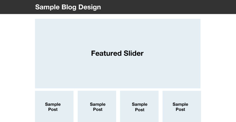 Try implementing a simple blog layout that contains the following elements:
- A top, fixed menu (that stays at the top of your screen, even when scrolling down)
- A large carousel at the top of the page (that, on a live site, may include featured articles/images)
- A column layout below the carousel with the following number of columns, based on device size:
- Desktops: 4
- Tablets: 2
- Phones: 1
Don’t forget to liberally consult the Bootstrap documentation. I promise that everything you need is in there!