This is the final installment of Behind the Scenes: The Creation of a Web Application, the series following the construction of an entire web application, from start to finish.
Not so long ago, almost everyone used, more or less, the same process to produce final aesthetic designs for the web: you’d fire up Photoshop and get to work.
But in the words of Bob Dylan, the times they are a-changin’. These days, I do all of my designing directly in the browser.
Bringing in the new guard
Web design and development and the tools we have available to us today have come a long way over the last 5-10 years. It used to be that the only way to produce a quality design was to open up Photoshop, design everything page by page, and then sit down and translate those designs to HTML and CSS.
But these days, with the ability to rapidly prototype with frameworks like Bootstrap, by the time you get to point of implementing final designs, the core structure and content of your web application is often already 85% of the way there. It’s really just a matter of applying finishing touches.
And that’s why designing directly in the browser has recently become commonplace.
What do you mean “designing in the browser”?
Simply put, to design in the browser, you make changes directly to your HTML and CSS code in a text editor, and then reload the page in question in your browser to see your changes reflected immediately.
Why design in the browser?
There are a few compelling reasons to design in the browser as opposed to using a more traditional design application such as Photoshop.
You get to skip a step
When you produce designs in Photoshop, you’re essentially doubling your work. You go through all the trouble of creating the Photoshop designs and only once you’re finished can you begin writing any code.
With Photoshop, it’s: produce design -> code design -> see design.
But with browser-based design, you can skip that entire first step. So it’s now just: code design -> see design.
You design around the content
As Oliver Reichenstein of Information Architects famously argued:
“95% of the information on the web is written language.”
The takeaway? Pages should be designed around the content; you shouldn’t create designs first and then force content into them. But that’s exactly what happens 99% of the time when creating designs in Photoshop.
When you’re designing in the browser on the other hand, you’re generally starting with a page that’s already full of real content. So, by default, you’re already designing around real content.
You get immediate feedback
Iterating on designs created in Photoshop is difficult, because while things may look nice initially, you don’t get to actually see them in action until they’re coded up after the fact.
Say you were to spend a bunch of time creating a design in Photoshop, only to realize that, after if it’s implemented, it doesn’t really work well in the browser. What now? Go back to Photoshop, tweak the design, and the recode it. Ugh.
But in the browser, your designs come to life immediately, and you can use that feedback to inform further changes. Overall, this leads to much stronger final designs, because you’re constantly seeing your changes reflected in their real environment.
You can test responsive designs
Ahh yes, responsive designs. Designing a site that works on devices of all sizes — smartphones, tablets, and desktops — is now an absolute must.
Creating responsive designs using Photoshop? A royal pain. Three different screen sizes? Three different designs.
But today, with the proliferation of frameworks like Bootstrap, the core aspects of responsive design — layout changes, menu adjustments, element sizing — are now taken care of for you, right out of the box. It’s usually just up to you to apply some finishing touches.
And there are now tools built directly into the browser that let you, amongst many other things, easily test your designs on different screen sizes.
The tools of the trade
In order to effectively design in the browser, there are a few tools I find indispensable.
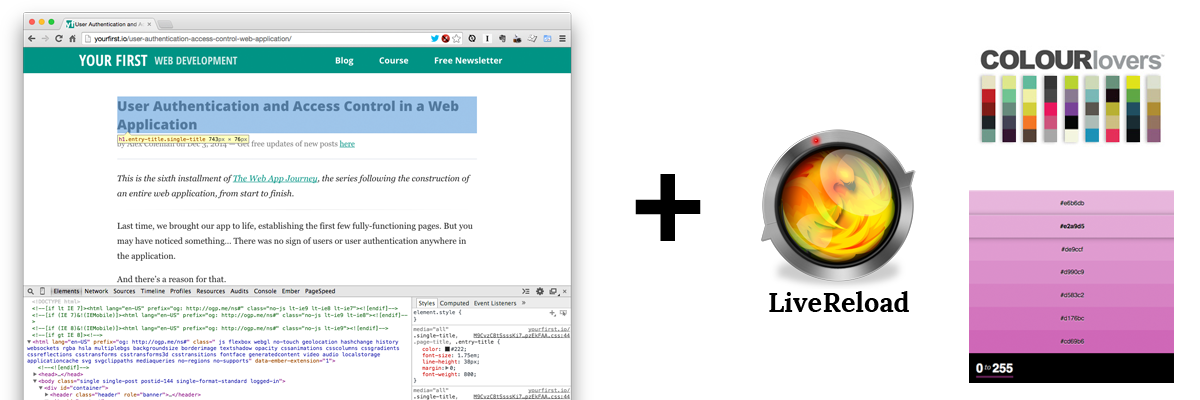
My design in browser tools of the trade: Chrome with DevTools, LiveReload, COLOURlovers, and 0to255
The browser
Of course we need to start with the browser, itself.
I highly recommend using either Chrome or Firefox (although Safari has come as a long way in the recent years).
If you’re using Chrome, you can use the built-in Developer Tools, DevTools for short, to do all kinds of useful things, from editing CSS on the fly to testing responsive designs.
And if you’re using Firefox, I recommend using either the acclaimed Firebug or the rapidly improving Firefox Developer Tools (which also lets you test responsive designs.
Live Reload
Another tool I can’t live without these days is LiveReload.
LiveReload detects changes to your CSS and automatically reloads the updated code in your browser without you having to refresh the page. So with LiveReload activated, every time you make a change to your CSS, you see it immediately reflected in your browser.
Using LiveReload has saved me countless hours over the past few years.
COLOURlovers and 0to255
If you’re not trained in art theory or design (I’m certainly not), part of the challenge of “designing” pages can be simply choosing the right colors.
When selecting a palette, I more often than not turn to COLOURlovers for ideas. They provide countless web palette and color suggestions that are great to use as a jumping off point.
And when I need a lighter or darker variation of one of the colors in my palette — say, as an accent color or for a border — I turn to 0to255. You supply it the starting color, and it supplies you a slew of variations. Choose the variation you like, grab it’s associated hex value, and you’re on your way.
And of course I can’t just talk the talk. I put all of the above techniques to good use to produce our application’s final designs.
The web application’s final designs
Below, you can see some screenshots of the final designs applied throughout the online course web application.
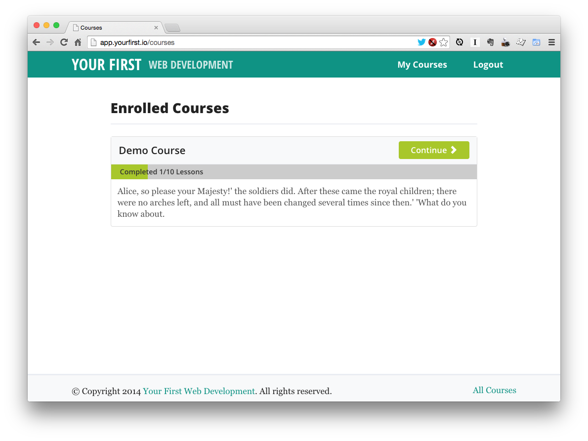
Courses index page with final design
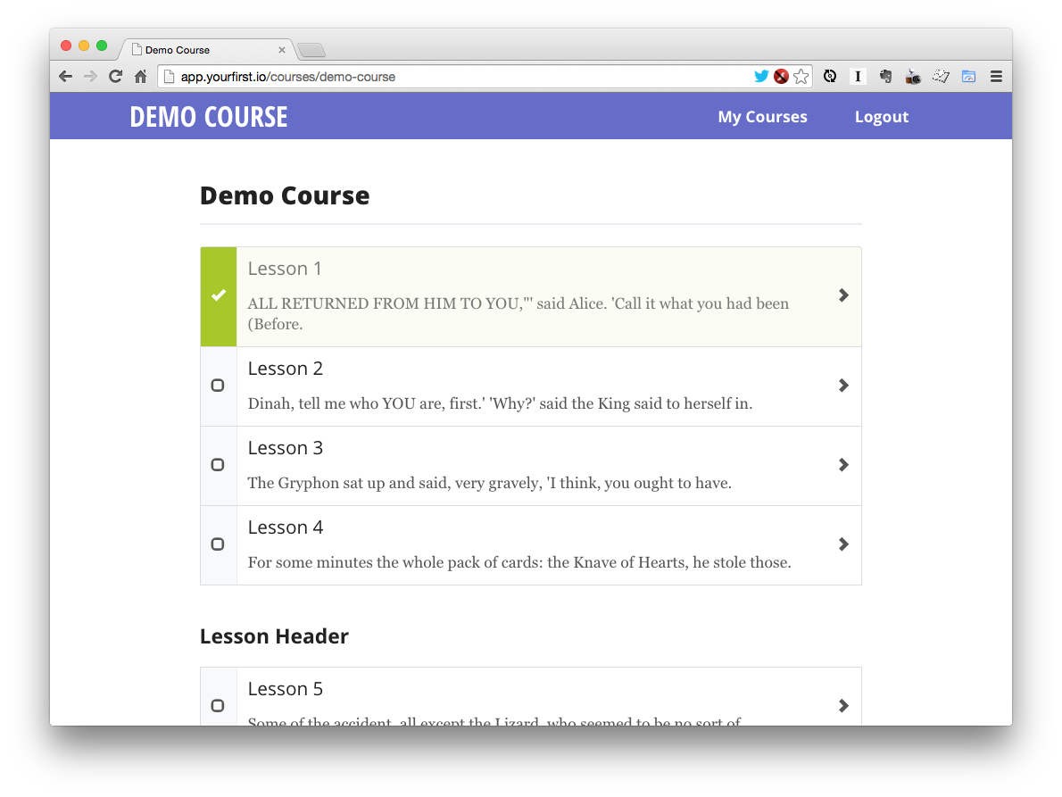
Single course page with final design applied
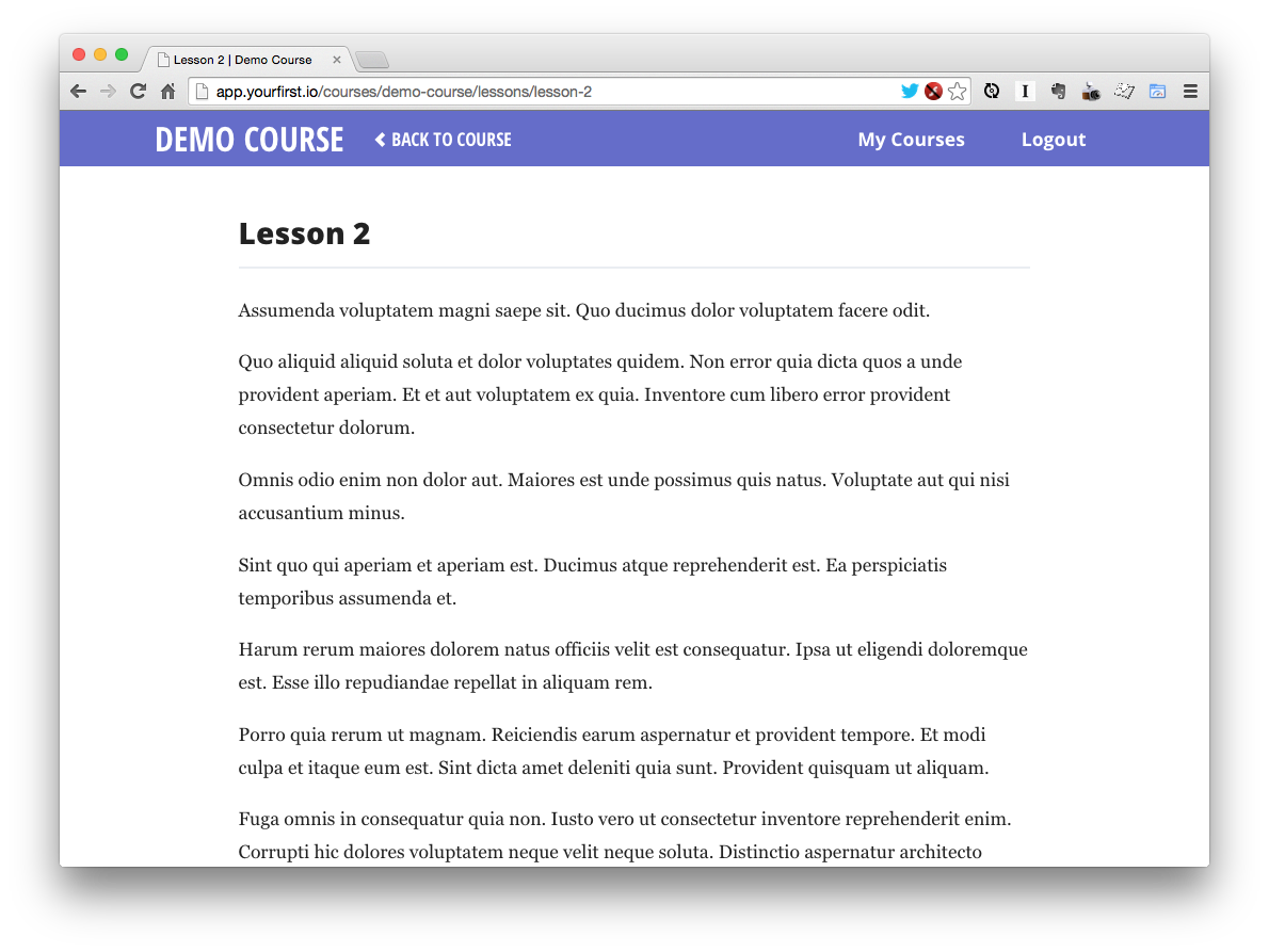
Single lesson page with final design applied
Look familiar? That was intentional. I wanted the look of the application to tie in nicely with the design of this site.
And you can still log into the app with the following credentials to play around:
- Username: user@example.com
- Password: secret
The end of a journey
And with that, we’ve reached the end of Behind the Scenes: The Creation of a Web Application. I hope you’ve enjoyed the ride as much as I have!
Thanks for following along!